Read more about the mobile solutions for some of our customers:
Archive for the ‘Cases’ Category
Read about mobile solutions here!
Tuesday, March 22nd, 2011Mobile Web and iPhone apps, hand in hand
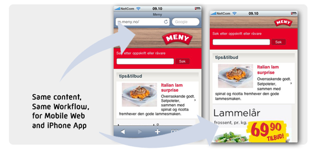
Wednesday, March 24th, 2010m.meny.no is a Norwegian convenience chain. Among other things, their online strategy is to utilize the personal relationship with their customers and bring added value to their shopping experience by providing dinner suggestions, food recipes and shopping lists for each customer.
Managing all this information, communicating in many channels, integrating a variety of systems can be challenging. Hence, keeping it down to one single workflow for all channels is crucial for Meny. This means that content and users (CRM) is managed one place for desktop websites, mobile web site and the iPhone application.
Their iPhone application is extremely cost efficient as the application contains a web browser that displays the iPhone optimized mobile website. This means that the contents of the iPhone app can be managed in their existing workflow and management systems while still utilizing the unique aspects of mobile web.
This way, Meny gets the best of both worlds
· Distribution in Appstore
· Low application development and maintenance cost.
· Integrated workflows
· Mobile web covering all mobile devices including applications
· Appstore business model, and Mobile Web business model available at the same time
With Mobiletech Frame this is an efficient way of distributing content across multiple platforms. Whit the web as platform and introduction of HTML5 functionality, such as offline access and local storage, mobile web based applications perform very well compared to native iPhone apps and scores much higher on flexibility.
Meny on mobile: http://m.meny.no/
Meny in the Appstore: search for “Meny”.
The Globe and Mail
Wednesday, December 16th, 2009Mobile publishing made easy
It’s never been easier to add mobile to your online presence.
"Escenic and Mobiletech will help form the solid foundation from which The Globe and Mail will build its online and mobile offerings for years to come. The power of the platform and the fact that it gave The Globe the ability to directly control our digital future were key factors in the decision” – Recent Escenic Mobile Solution customer, Angus Frame, the Vice-President of Digital Media at The Globe and Mail.
The Globe and Mail mobile site: http://m.theglobeandmail.com/
The Escenic Mobile Solution is a complete solution for creating and publishing mobile specific websites with the needs of the mobile user in mind. Previous fragmented solutions for the mobile can now be replaced by a modern digital workflow which allows editorial staff to make changes to content instantly in response to changing end user patterns.
The Washington Post powered by Mobiletech
Wednesday, December 16th, 2009The Washington Post selects Mobiletech to power new mobile website.
The Washington Post has unveiled a new mobile version of its website as it seeks to catch up to and surpass the competition in the mobile arena.
The new mobile site is designed for maximum utility for local users, with customized information on things like public transportation, weather and entertainment. And in the very near future the mobile site will let readers make restaurant reservations, buy movie tickets and get real-time traffic routes.
KAUST – King Abdullah University of Science and Technology
Wednesday, December 16th, 2009KAUST – King Abdullah University of Science and Technology
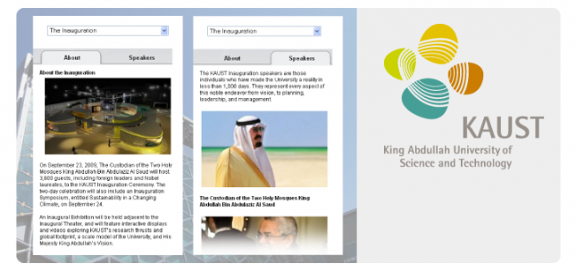
Fleishman-Hillard recently appointed Mobiletech to partner in the custom development of a mobile site for the King Abdullah University of Science and Technology (KAUST), in conjunction with the KAUST Inauguration Ceremony on September 23rd 2009. The Fleishman-Hillard team was responsible for the concept, strategy, and design of the site, and Mobiletech turned the designs into the most distinguished mobile university site live today.
In creating the KAUST mobile site, Fleishman-Hillard’s goal was to establish a mobile presence that would enhance the reputation of this world-class science and technology institution. Furthermore, the site needed to provide an engaging user experience, demonstrate a technically flawless execution, and impress key stakeholders with a visually stunning interface.
|
Oslo
Prinsens gate 22
0157, Oslo Norway
Phone: +47 400 01 282
|
Bergen
Nordre Nøstekai 1
5011, Bergen Norway
Phone: +47 400 01 282
|
Stockholm
Torsgatan 8A
111 23, Stockholm Sweden
Phone: +46 (0)709161967
|
Copenhagen
Carl Jacobsens Vej 16, opgang 1
2500, Valby Denmark
Phone: +45 7022 1969
|
Washington DC
1629 K St. NW, suite 300Washington DC, 20006 USA
Phone: +1 301 648 3485
|
Follow Mobiletech:
|
Copyright © 2011 Mobiletech AS |


