Archive for 2009

The mobile highway in 2010

Friday, December 18th, 2009

It is finally time to look ahead into the next year of mobile. 2009 has most certainly been “a year of mobile”, but 2010 will be even bigger. You can read the our blog post of predictions for 2009 and you will see that most of it actually happened. 2009 was the year when the world finally realised the potential of mobile and how freaking huge it is and how much it will grow! There are 3.8 billion mobile phones out there. 2009 was the year where more people were surfing mobile web than desktop web. 1.2 billion mobile web surfer vs.. 1 billion desktop web surfers. So Mobiletech agrees with the CEOs of Google, Microsoft, Apple and Yahoo: Mobile Internet Is and Will be Bigger Than Most Think! (Morgan Stanley).

So what about 2010? You think stuff happened quickly in 2009? Brace yourselves for 2010! The content owners have just learned enough about how mobile web works to make decisions, but during 2010 the basis of these decisions will already be old fashioned, wrong and will lead to many failing investments and efforts. Below I will explain shortly a few areas worth following.

The handsets

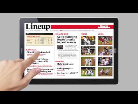
The iPhone is a game-changer. Hence, many have focused on the iPhone by creating iPhone sites. Mobiletech has been shouting since iPhone was launched: “IT IS NOT ABOUT THE IPHONE!”, and 2010 will prove that. iPhone will still be a popular device, but there will be others. We see some of these devices today, but 2010 will show us more. Google will launch a phone, new Android devices will come, Nokia is looking for the holy grail. So for those believing that the mobile technology market will soon be defragmented, sorry, but the fragmentation will be worse than ever. Even among Android devices. Even if iPhone is still going to be the most important device on the mobile web in 2010 you will exclude most users if you choose to go for an “iPhone site”. So, it’s not about the iPhone, it is really about the new interaction model introduced by the iPhone. This interaction model will be the dominant for most new devices in 2010 but the implementation of the interaction model will be fragmented due to different handset capabilities and browsers. And not to forget e-readers. Is the Kindle a mobile device? what about tablets? Take a look at this YouTube video, and this digital magazine.
YouTube Preview Image

Is this a mobile device? Can you publish your desktop web to these kinds of devices you think? No you can’t. So, fragmentation is still the keyword for 2010 when it comes to handsets and devices.

Apps?

So what about the 2009-famous iPhone apps? 2010 will be the year of maintenance cost of applications. In 2009 applications have been funded of the marketing budget is my judgement. But that does not make sense for long term maintenance of software stuff. Apps are still important as “app stores” pop up all over that place and some of them are good distribution channels. The mobile web will however be the basis of the most successful applications of those that survive the year of maintenance cost of iPhone apps.

Widgets, the new apps.

Widgets, small web apps running on your home screen, will start to emerge in 2010. We have seen a preview this year already on Nokia N97 for example. Widgets are built on web technology and behave exactly as an application, or even better in most cases. The beauty of widgets is that they are built on web technology; mark-up, JavaScript and css. That means that there is a synergy to what you do on your “general” mobile web presence.

But what about accessing the GPS, camera, address book and all the other cool stuff applications can a website can’t? Well, in 2010 support for HTML5 will be implemented in mobile browsers more widely than today. HTML5 provides many features that will really enrich the mobile web. Offline storage, and many of the features you find in Google Gears, will be implemented. I addition, W3C is working on device APIs that enables access to camera, address book, calendar etc. from the browser. This work will not finish for some time yet, but we see already that for example the iPhone has implemented access to the GPS from the browser.

The mobile operators role

What is the most popular mobile operator in terms of connecting to the internet you think? It’s Wi-Fi. In US close to 30% are surfing the mobile web over Wi-Fi. In Norway the number is 46%. This change happened mainly in 2009 and will continue into 2010. This means that mobile internet services that traditionally have relied upon value adding services from the mobile operator, such as billing and location will be useless during 2010. Be sure to adapt to how the users use your mobile web offering. Some mobile operators will also start evaluating their need for a mobile web portal/walled garden for their users. Maybe some bold and smart operators will discontinue their current portal efforts as well.

Another evidence of mobile operators loosing power in the mobile industry is that Nokia will not have a presence as usual at the Mobile World Congress in 2010. Further, handset manufacturers will want more control with their handsets, as Nokia with their Maemo, leaving less options for the mobile operators.

Mobile = Social

I wrote last year that social networks will be big. And they have become! Really big! 25% of all Facebook users are using their mobile. And there are lots of other examples. This is not such strange thing when we know that mobile is first and foremost a social thingy. The lesson is still don’t try to create a social network, join others. I still use the Norwegian newspaper Dagbladet as an excellent example of adding value to this service by connecting to Facebook Connect. It is on mobile web we will see “Web 2.0” materialising. The biggest mistake to make in 2010 is probably to NOT include the mobile in new internet projects!

Closing words

From a great and massive report by Morgan Stanley. They put it very well by saying:

Mobile Internet Is and Will be Bigger Than Most Think

And following up with:

Rapid Ramp of Mobile Internet Usage Will be a Boon to Consumers and Some Companies Will Likely Win Big (Potentially Very Big) While Many Will Wonder What Just Happened.

Share

The Globe and Mail

Wednesday, December 16th, 2009

mt_casestudy_globeandmail

Mobile publishing made easy

It’s never been easier to add mobile to your online presence.

"Escenic and Mobiletech will help form the solid foundation from which The Globe and Mail will build its online and mobile offerings for years to come. The power of the platform and the fact that it gave The Globe the ability to directly control our digital future were key factors in the decision” – Recent Escenic Mobile Solution customer, Angus Frame, the Vice-President of Digital Media at The Globe and Mail.

The Globe and Mail mobile site: http://m.theglobeandmail.com/

The Escenic Mobile Solution is a complete solution for creating and publishing mobile specific websites with the needs of the mobile user in mind. Previous fragmented solutions for the mobile can now be replaced by a modern digital workflow which allows editorial staff to make changes to content instantly in response to changing end user patterns.

(more…)

Share

The Washington Post powered by Mobiletech

Wednesday, December 16th, 2009

mt_casestudy_washingtonpost.png

The Washington Post selects Mobiletech to power new mobile website.

The Washington Post has unveiled a new mobile version of its website as it seeks to catch up to and surpass the competition in the mobile arena.

The new mobile site is designed for maximum utility for local users, with customized information on things like public transportation, weather and entertainment.  And in the very near future the mobile site will let readers make restaurant reservations, buy movie tickets and get real-time traffic routes.

(more…)

Share

KAUST – King Abdullah University of Science and Technology

Wednesday, December 16th, 2009

mt_casestudy_kaust

KAUST – King Abdullah University of Science and Technology

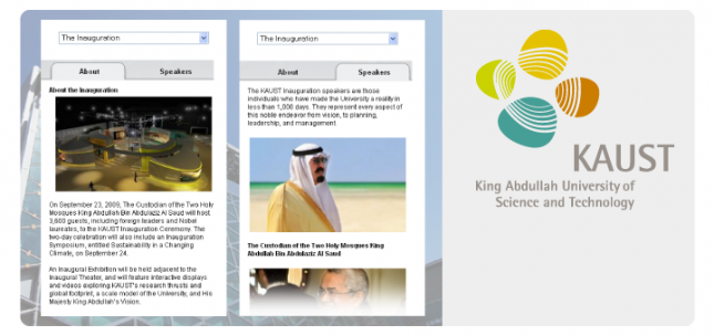
Fleishman-Hillard recently appointed Mobiletech to partner in the custom development of a mobile site for the King Abdullah University of Science and Technology (KAUST), in conjunction with the KAUST Inauguration Ceremony on September 23rd 2009.  The Fleishman-Hillard team was responsible for the concept, strategy, and design of the site, and Mobiletech turned the designs into the most distinguished mobile university site live today.

In creating the KAUST mobile site, Fleishman-Hillard’s goal was to establish a mobile presence that would enhance the reputation of this world-class science and technology institution. Furthermore, the site needed to provide an engaging user experience, demonstrate a technically flawless execution, and impress key stakeholders with a visually stunning interface.

(more…)

Share

Book time with the Mobiletech’ers at MWC 2010

Friday, December 11th, 2009

As usual Mobiletech is attending Mobile World Congress in Barcelona in February

You can already now book time to meet us. Fill in the form below.

Share

Mobiletech starting up the first developer course in Stockholm and Washington DC.

Thursday, November 26th, 2009

Mobiletech takes great pleasure inviting customers and contacts with a mobile interest to one day training course on the latest techniques and tools for effective use of the mobile web. The tutor on this occasion is the Head of Development in Mobiletech Sweden. The curriculum will include mobile web development in general, but also contain an in depth look into some features of the Mobiletech Mobile Web Framework. The focus will be on the challenges of mobile site development and how you can use your web developer experience to create great mobile web sites.

It will include topics as:

  • Mobile “standards” and technologies
  • Device detection and adaptation
  • Testing
  • Demo of the Mobiletech Framework
  • Real life examples
  • Safari webkit specific features (iPhone, Android and Palm Pre)
  • What’s to come

Who should attend:
Developers with web experience, and Java and JSP knowledge is recommended. Prior experience with Mobiletech’s Framework is not required.

Speaker:
Anders Magnus Andersen (Stockholm and Washington DC)
Anders is the Head of Development in Mobiletech’s Stockholm office and is also the technical product manager of “Mobiletech’s Mobile Web Framework”.
During his 5 years at Mobiletech, Anders has acquired a substantial amount of technical and market knowledge about the mobile web. Anders has a track record full of award-winning mobile sites in Scandinavia, and is a key figure in Mobiletech’s technical development.
Johan Simonsson (Stockholm)
Johan is one of the main developers in the “Frame team” and has long experience with mobile development including location based services, messaging services and mobile gaming.

Share

Mobiletech Frame

Wednesday, November 4th, 2009

mobiletech_frontbanner_04

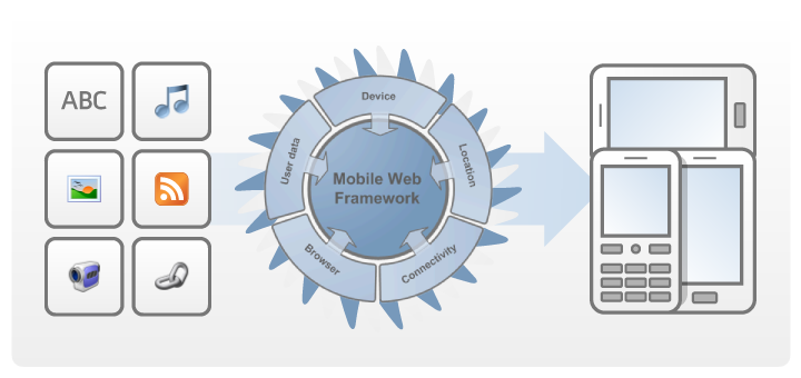
Mobiletech Frame is Mobiletechs offering for building advanced mobile web sites. The framework is made for work flow integration and flexible deployment.

Read more.

Share

Escenic Mobile Solution

Wednesday, November 4th, 2009

escenic_banner_01
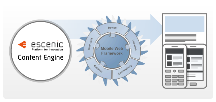
The Escenic Mobile Solution is a fully integrated mobile web rendering engine. 100% transparent to the editor providing full editorial freedom and control.

Key features

  • Unique, modern and future compliant approach to content adaption to the mobile context.
  • Integration into existing workflows to utilize editorial expertise and resources.
  • One single code base for all devices, browsers and interaction models to ease development and maintenance.
  • Providing editorial -control and -freedom as well as control over the technical value chain
  • Flexible deployment and software delivery models
  • Creative flexibility
  • Easy and controllable integration to legacy systems and 3rd parties
  • Well documented development environment enables the customers mobile developers to excel

Read more.

Share

Google CEO, Eric Schmidt, on mobile

Tuesday, November 3rd, 2009

Google CEO, Eric Schmidt, is embracing mobile. Watch this video on youtube.

As we Mobiletech’ers have known for years, Schmidt says that a mobile connected with the cloud can do “magical things”.

“The mobile platforms, Android and the others, are so powerful now that you can build client apps that do magical things that are connected with the cloud. This is I think the most visually obvious example of that…don’t limit your imagination to this set of problems. Anything where you can produce this phenomenal customer benefit when you have a mobile device broadly defined connected to the cloud….Obviously we like the price of free because the consumers like that as well and we can figure out ways to use advertising to pay for it.”

Share

Mobiletech-article in Finansavisen

Tuesday, October 27th, 2009
Monday 26th of October Mobiletech was featured in the Norwegian financial newspaper Finansavisen.

Below is a scan of the article. The article is in Norwegian.

From Finansavisen 26th Oct. 2009

Share
 

Oslo
Prinsens gate 22
0157, Oslo
Norway
Phone: +47 400 01 282
Bergen
Nordre Nøstekai 1
5011, Bergen
Norway
Phone: +47 400 01 282
Stockholm
Torsgatan 8A
111 23, Stockholm
Sweden
Phone: +46 (0)709161967
Copenhagen
Carl Jacobsens Vej 16, opgang 1
2500, Valby
Denmark
Phone: +45 7022 1969
Washington
USA
Phone: +1 301 648 3485

Follow Mobiletech:

Status

  • Twitter
  • Facebook
  • FriendFeed
  • identi.ca

News & Blog

  • RSS
  • IntenseDebate
  • LinkedIn
  • Eventbrite
  • Activity Calendar

Sharing

  • Slideshare
  • Vimeo
  • YouTube

Sign up for newsletter

View previous campaigns.

Copyright © 2010 Mobiletech AS