A while back, I blogged about mobile search and the impact on mobile commerce. There we covered why it is important to be visible in mobile search results. Now we will cover how: Mobile SEO. (You might find that the examples below are all Google, here is why)
To warm up, let us see how Google them selves defines a mobile device:
- Traditional mobile phones: Phones with browsers that cannot render normal desktop webpages. This includes browsers for cHTML (iMode), WML, WAP, and the like.
-
Smartphones: Phones with browsers that render normal desktop pages, at least to some extent. This category includes a diversity of devices, such Windows Phone 7, Blackberry devices, iPhones, and Android phones, and also tablets and eBook readers.
We can further break down this category by support for HTML5:
- Devices with browsers that do not support HTML5
- Devices with browsers that support HTML5
First, lets look at some of the differences between mobile search an “the other kind of search” (One of the things that IS similar is actually the general rules of common SEO, so I will not cover that in this post).
Different use cases
According to Google, this is a common use case on mobile search:
Further, it goes without saying that mobile users are, well, mobile. This reflects the things they are searching for. Mobile is not the typical tool when googling research for your PhD thesis, to put it that way.
Eric Schmidt illustrates the other differences between mobile- and desktop search well here:
The number of mobile searches for Chrysler, for instance, jumped 102 times during the game, compared with only 48 times for desktop searches. And the number of mobile searches for GoDaddy jumped 315 times, compared with 38 times on desktops.
This shows how powerful mobile SEO is in relation to other advertising. Mobile is where the customers take action.
So given the different use cases, a different user interface is needed.
If we look at the screenshot of Google below, we se that two dimensions are added to the search: 1) verticals 2) location.

Vertical search meaning business sectors, or categories, such as Restaurants, Coffee, Bars, Shops, ATM’s etc. Combining this with location makes sense when you are looking for bars in your neighborhood. Currently, Google search is actually made for moving searchers from the streets and in to your store! One very good reason to get a mobile optimized web site, and continue reading this post :)
Another use case worth mentioning is searching from Google Maps on your smartphone. That is my favorite when traveling.

This is another great example of how important location is in mobile search.
Different ranking
Even if you have a top ranked desktop web site and done your SEO homework, this does not mean that you are ranked high for mobile search too. But it helps, though.
As Bryson Meunier demonstrates below, there are differences in ranking (This research is a few years old…).
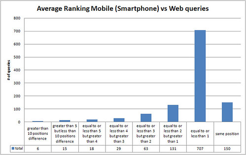
What I discovered is that while 13.42% of the queries have the same ranking in desktop results that they do in smartphone results, the great majority of the queries do vary slightly. Nearly a quarter of the listings vary by two positions or more, which in the limited real estate of smartphone screens might as well be page ten. And for a small percentage of the listings, the difference in ranking can be as much as ten positions or more
As noted earlier, location and verticals also have more to say on mobile than on desktop when ranking the results. And there is also mobile search results blending in. Google obviously want to present the users with the most relevant content, so a mix of desktop designed sites and sites for mobile devices are sometimes shown. Provided that the mobile site has implemented the “general rules of SEO”, like using the semantics of HTML, friendly URLs etc., of course.
So what can be done to be more visible in mobile search results? Here are a few tricks.
1. Mobile friendly site
This goes without saying… Make sure your site makes sense to your mobile users.
2. Add your business to Google Places
Get listed on Google maps, and appear in search results when someone is near by is looking for your services.

Adding your self is pretty easy, just go to Google Places to add, or claim your business. Follow the steps required, add some info and you are good to go. Don’t forget; the info you put in, should be carefully edited with SEO and keywords in mind. Further, It would not hurt to get recommendations and reviews on your profile either… Mobile is a social device, so using social networks and interact with your end users is generally important, but might prove more important on mobile.
Another trick to help search engines detect your vital information, such as store location and contact information is to use micro-formats in your HTML markup.
Here is an example:
<div class="vcard">
   <span class="fn org">L'Amourita Pizza</span>
   Located at
     <div class="adr">
        <span class="street-address">123 Main St</span>, <span class="locality">Albuquerque</span>, <span class="region">NM</span>.
     </div>
     <span class="geo">
        <span class="latitude">
           <span class="value-title" title="37.774929"></span>
        </span>
        <span class="longitude">
           <span class="value-title" title="-122.419416"></span>
        </span>
     </span>
   Phone: <span class="tel">206-555-1234</span>
   <a href="http://pizza.example.com/" class="url">http://pizza.example.com</a>
</div>
This will help Google and other search engines to put your business on the map. Micro-formats is can also be used for reviews, people, products, events etc.
3. Make sure you site is fast
Rendering speed that is. So if you use heavy images, tons of JavaScript and CSS and generally making the user experience poor by providing a slow site, Google will degrade the site. And speed is actually money:
- Bing found that a 2 second slowdown changed queries/user by -1.8% and revenue/user by -4.3%.
- Shopzilla reduced load time from 7 to 2 seconds, this resulted in a 25% increase in page views, a 7-12% increase in revenue, and a 50% reduction in hardware
On mobile it is good reason to believe that speed is even more important than on desktop web due to the “burst like” use cases we see on mobile; short but frequent tasks.
Google is listing a few tools to monitor your site speed on their webmaster central. Also, it worth mentioning the HTML5 features local storage and application cache, which will help to make your site even faster.
4. Don’t forget images and videos
YouTube has more than 200 mill playbacks per day from mobile devices and is growing faster than all internal predictions. According to Google, search for images is also a popular task on mobile devices. Therefore it is important to consider how you name the images, use alt attribute on image tags with a relevant description, use captions and maybe even the title attribute. However, the most important thing is what’s around the image on the page it self.
5. Tell Google about your mobile site
The Google-bot is the crawler that collects all the data for Google. Google has many different bots, but for simplicity, we can say they have one for mobile and one for none-mobile.
And, it is worth noticing that the Google Mobile crawler is only used for traditional mobile phone (feature phones) content. So in the search result, feature phones will get nice little green phones next to the urls on the result page indicating that it is safe for a none-smartphone user to click through:

Smartphones gets content crawled with Googles regular desktop crawler assuming that Smartphones can handle desktop versions of websites OK.
Do not exclude any Google bot from your sites, even if it means more load on your servers. A complete list of Google bots you must allow can be found here.
Moreover, if you have separate a mobile site url, remember to redirect both your users and the Google Mobile bot with a 301 permanent redirect.
Submit sitemaps of your mobile site too. So now you need two sitemaps; one for feature phones, and another for “other devices that should support a site made for desktops”. Make sure to link to the sitemap from your robots.txt file.
On your site made for desktop browsing, remember to include this line of HTML in your <head> section:
<link rel=”alternate” media=”handheld” href=”http://m.cnn.com” title=”Mobile site”/>
And while you are at it, use the HTTP header “Vary” to announce that the contents of this page is depending on what User-Agent is accessing the page.
This will tell the Google Mobile bot that there is a mobile version of the site that should be indexed. The Google Transcoder will also honor this.
If your site is not showing up in the Google index, Google highlights a couple of potential reasons why not.
6. Keywords and search suggestions

You should continue to do general keyword optimization just like for desktop web sites. On mobile, however, the “as you type suggestions”, both on the Google mobile search site and in apps, provide useful phrases that should also be included in your keywords. The search suggestions are more widely used on mobile because it is more convenient than typing the full phrase.
A few closing words
I briefly mentioned the Google Transcoder earlier. The purpose of the transcoder is basically to make a site made for desktop devices readable on feature phones. In this process, the site structure, layout and design is completely destroyed. I is highly recommended to take measures to avoid that pages are transcoded. The transcoded page will probably not do any good for your end users anyway.
Those of you who have some experience with SEO, are probably thinking about the “cloaking issue” by now. Cloaking means that different content are served from the same url depending on user-agent. Google takes this very seriously, and if cloaking is detected, the site can be removed from the Google Index.
Even if mobile optimizing is similar to cloaking, Google does not consider this cloaking as long as the Google Mobile bot gets the same content as mobile devices. This is explained in this video from Google.
The same goes for the “duplication of content” issue. Even if similar content is served from two different URLs, i.e. cnn.com and m.cnn.com, this will not negatively affect the ranking.
Read more on mobile search:
- Google Webmaster Tools, Mobile
- Search Engine OptimizationStarter Guide (pdf)
- Google: Making Websites Mobile Friendly
- Search Engine Land: The New Mobile SEO: What You Need To Know


 Sweden:
