
To warm up, let us see how Google them selves defines a mobile device:
We can further break down this category by support for HTML5:
First, lets look at some of the differences between mobile search an “the other kind of search” (One of the things that IS similar is actually the general rules of common SEO, so I will not cover that in this post).
According to Google, this is a common use case on mobile search:
Further, it goes without saying that mobile users are, well, mobile. This reflects the things they are searching for. Mobile is not the typical tool when googling research for your PhD thesis, to put it that way.
Eric Schmidt illustrates the other differences between mobile- and desktop search well here:
The number of mobile searches for Chrysler, for instance, jumped 102 times during the game, compared with only 48 times for desktop searches. And the number of mobile searches for GoDaddy jumped 315 times, compared with 38 times on desktops.
This shows how powerful mobile SEO is in relation to other advertising. Mobile is where the customers take action.
So given the different use cases, a different user interface is needed.
If we look at the screenshot of Google below, we se that two dimensions are added to the search: 1) verticals 2) location.

Vertical search meaning business sectors, or categories, such as Restaurants, Coffee, Bars, Shops, ATM’s etc. Combining this with location makes sense when you are looking for bars in your neighborhood. Currently, Google search is actually made for moving searchers from the streets and in to your store! One very good reason to get a mobile optimized web site, and continue reading this post :)
Another use case worth mentioning is searching from Google Maps on your smartphone. That is my favorite when traveling.

This is another great example of how important location is in mobile search.
Even if you have a top ranked desktop web site and done your SEO homework, this does not mean that you are ranked high for mobile search too. But it helps, though.
As Bryson Meunier demonstrates below, there are differences in ranking (This research is a few years old…).
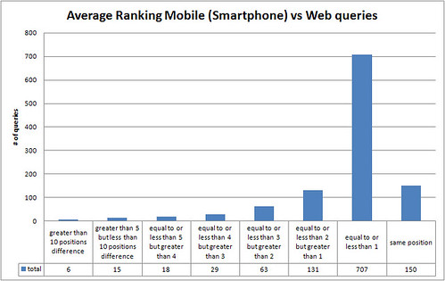
What I discovered is that while 13.42% of the queries have the same ranking in desktop results that they do in smartphone results, the great majority of the queries do vary slightly. Nearly a quarter of the listings vary by two positions or more, which in the limited real estate of smartphone screens might as well be page ten. And for a small percentage of the listings, the difference in ranking can be as much as ten positions or more
As noted earlier, location and verticals also have more to say on mobile than on desktop when ranking the results. And there is also mobile search results blending in. Google obviously want to present the users with the most relevant content, so a mix of desktop designed sites and sites for mobile devices are sometimes shown. Provided that the mobile site has implemented the “general rules of SEO”, like using the semantics of HTML, friendly URLs etc., of course.
So what can be done to be more visible in mobile search results? Here are a few tricks.
This goes without saying… Make sure your site makes sense to your mobile users.
Get listed on Google maps, and appear in search results when someone is near by is looking for your services.

Adding your self is pretty easy, just go to Google Places to add, or claim your business. Follow the steps required, add some info and you are good to go. Don’t forget; the info you put in, should be carefully edited with SEO and keywords in mind. Further, It would not hurt to get recommendations and reviews on your profile either… Mobile is a social device, so using social networks and interact with your end users is generally important, but might prove more important on mobile.
Another trick to help search engines detect your vital information, such as store location and contact information is to use micro-formats in your HTML markup.
Here is an example:
<div class="vcard">
   <span class="fn org">L'Amourita Pizza</span>
   Located at
     <div class="adr">
        <span class="street-address">123 Main St</span>, <span class="locality">Albuquerque</span>, <span class="region">NM</span>.
     </div>
     <span class="geo">
        <span class="latitude">
           <span class="value-title" title="37.774929"></span>
        </span>
        <span class="longitude">
           <span class="value-title" title="-122.419416"></span>
        </span>
     </span>
   Phone: <span class="tel">206-555-1234</span>
   <a href="http://pizza.example.com/" class="url">http://pizza.example.com</a>
</div>
This will help Google and other search engines to put your business on the map. Micro-formats is can also be used for reviews, people, products, events etc.
Rendering speed that is. So if you use heavy images, tons of JavaScript and CSS and generally making the user experience poor by providing a slow site, Google will degrade the site. And speed is actually money:
On mobile it is good reason to believe that speed is even more important than on desktop web due to the “burst like” use cases we see on mobile; short but frequent tasks.
Google is listing a few tools to monitor your site speed on their webmaster central. Also, it worth mentioning the HTML5 features local storage and application cache, which will help to make your site even faster.
YouTube has more than 200 mill playbacks per day from mobile devices and is growing faster than all internal predictions. According to Google, search for images is also a popular task on mobile devices. Therefore it is important to consider how you name the images, use alt attribute on image tags with a relevant description, use captions and maybe even the title attribute. However, the most important thing is what’s around the image on the page it self.
The Google-bot is the crawler that collects all the data for Google. Google has many different bots, but for simplicity, we can say they have one for mobile and one for none-mobile.
And, it is worth noticing that the Google Mobile crawler is only used for traditional mobile phone (feature phones) content. So in the search result, feature phones will get nice little green phones next to the urls on the result page indicating that it is safe for a none-smartphone user to click through:

Smartphones gets content crawled with Googles regular desktop crawler assuming that Smartphones can handle desktop versions of websites OK.
Do not exclude any Google bot from your sites, even if it means more load on your servers. A complete list of Google bots you must allow can be found here.
Moreover, if you have separate a mobile site url, remember to redirect both your users and the Google Mobile bot with a 301 permanent redirect.
Submit sitemaps of your mobile site too. So now you need two sitemaps; one for feature phones, and another for “other devices that should support a site made for desktops”. Make sure to link to the sitemap from your robots.txt file.
On your site made for desktop browsing, remember to include this line of HTML in your <head> section:
<link rel=”alternate” media=”handheld” href=”http://m.cnn.com” title=”Mobile site”/>
And while you are at it, use the HTTP header “Vary” to announce that the contents of this page is depending on what User-Agent is accessing the page.
This will tell the Google Mobile bot that there is a mobile version of the site that should be indexed. The Google Transcoder will also honor this.
If your site is not showing up in the Google index, Google highlights a couple of potential reasons why not.

You should continue to do general keyword optimization just like for desktop web sites. On mobile, however, the “as you type suggestions”, both on the Google mobile search site and in apps, provide useful phrases that should also be included in your keywords. The search suggestions are more widely used on mobile because it is more convenient than typing the full phrase.
I briefly mentioned the Google Transcoder earlier. The purpose of the transcoder is basically to make a site made for desktop devices readable on feature phones. In this process, the site structure, layout and design is completely destroyed. I is highly recommended to take measures to avoid that pages are transcoded. The transcoded page will probably not do any good for your end users anyway.
Those of you who have some experience with SEO, are probably thinking about the “cloaking issue” by now. Cloaking means that different content are served from the same url depending on user-agent. Google takes this very seriously, and if cloaking is detected, the site can be removed from the Google Index.
Even if mobile optimizing is similar to cloaking, Google does not consider this cloaking as long as the Google Mobile bot gets the same content as mobile devices. This is explained in this video from Google.
The same goes for the “duplication of content” issue. Even if similar content is served from two different URLs, i.e. cnn.com and m.cnn.com, this will not negatively affect the ranking.
Read more on mobile search:
Google is investing much time and efforts into mobile search these days. Putting “Mobile First” they try to make the search on mobile as relevant as possible to the end user. Yes, this means googling on your mobile will give different search results than googling from a PC. Different rules apply. That means that “your regular SEO tricks” you use on your desktop web site won’t necessarily work on mobile.
In a mini-series of two posts I will cover what mobile search means for your business (part 1) and how to optimize your web site for mobile search, Mobile SEO (part 2).
But first:
How big is mobile web search?

There are no good studies with real numbers describing how big mobile search is. Google won’t tell us anything else than “Mobile search is growing fast”. There are however, a few bits and pieces we can put together to give an estimate to illustrate the impact of search on mobile and the importance of mobile SEO.
First, it is quite safe to assume that Google has 100% of search on mobile (same for payed search) for this experiment.
Next, comScore reported in January 2010 that Google accounted for close to 90 billion searches per month in December 2009. This was a growth of 58% year over year. Let us assume mobile searches is included in these numbers. Even if Google says that mobile searches grew 130% during 2009, lets simplify and say that all of Googles search traffic grew by 58% also during 2010. Then the number of searches is 138 billion. So, how many of these searches comes from a mobile device? Searchengineland.com quotes Google and says that mobile accounts for 15% of all search volume.
Then the number of web searches performed from mobile devices per month is a whopping 20,7 billion. 690 million searches per day, 29 million pr hour. These numbers are probably way too conservative, knowing that Mobile search is growing faster than search form desktop computers!
It goes without saying that being visible in search results on a mobile device is important.
Why is it important to be visible in mobile search results?
However, equally important, or even more important, actually; have a mobile optimized web site ready! More and more end users reaching out to you online, are doing it using a mobile phone.
According to Google, and their recent study “The mobile Movement: Understanding Smartphone Users” (*), 81% browse the Internet, 77% search, 68% use an app, and 48% watch videos on their smartphone.
Further, Google also says that every third search from a mobile device, has an intent of finding something locally.
So, the users context is key; location. Users are searching for flower shops and restaurants, not long wikipedia articles about or stock prices. They need to buy flowers for their date, and find a restaurant to take her/him. You know what I mean. But wait! This is commerce! This is actually driving people to spend money in your store!
Here is what Google found in their study:
This tells us that Mobile phone users are ready to shop. Jwire found that
79 percent of mobile users are comfortable making purchases on their mobile devices and 50 percent …are confident spending more than $100 on a purchase from their device – nearly 20 percent are even comfortable
Marks & Spencer’s mobile site has even taken single purchase orders exceeding £3,000!
Gartner also believe that mobile commerce will become a hit too:
Gartner expects richer mobile commerce capabilities to expand from native apps to the mobile browser as HTML5 starts to be deployed
How to take part in this growth of m-commerce? Well first you need a web site that goes well with you mobile users device, whether it is a mobile phone or some kind or a tablet.
Google found that only 21% of Google’s largest advertisers have a website that is optimized for mobile. That’s 79% serving up a less than ideal experience for their mobile customers.
It is no use presenting your users with a huge site with lots of flash on it.
But to get to the finish of this blog, let’s assume that you already have a mobile web site (made by Mobiletech, of course;) )
Key take-aways
21,7 bill searches from mobile phones. Mobile will continue to increase its piece in the search pie chart. And it will happen faster than most think.
Users want and are capable of using their mobile phone to purchase or to do research before purchase.
Most advertisers on Google does not have a mobile optimized user experience and are missing out on this huge opportunity.
As local is so important in mobile search, it makes sense for smaller, local “shops on the corner” to take on mobile too.
Next post will cover a few tricks on how to get visibility in mobile search results.
*) This study featured 5,013 US adult smartphone Internet users. Smartphone penetration is about 30% globally, and in US.

The above graph shows the increase in unique users in Norway compared to Sweden. (The bump in the Norwegian line is because nrk.no did some wired stuff, so ignore that. You’ll see the reason in the detailed graph below). The numbers are not including all Norwegian and Swedish sites, but only those listed here and here.
Click below to take a closer look at each country.
Norway: 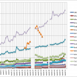 Sweden:
These numbers are based on what Mobiletech does together with TNS-Gallup and TNS-Sifo with mobile web statistics in Norway and Sweden. The numbers are freely available. The calculation I have made is not 100% correct down to every single page view, but gives a representative view of the market.
Further, Mobiletech does stuff on our own as well so I have compiled some device statistics:
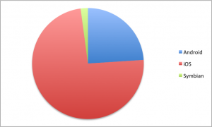
iOS (iPhone, iPod and iPad) was in the last month of 2010 accounting for 74% of all page views in Norway and Sweden together. Android 24% and Symbian 2%. These numbers are extracted from the top 10 devices which are:
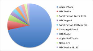
iPhone (all versions) now used for 72% of all page views in Norway and Sweden. Nokia E71 is the only Symbian device on this top 10 list. Another observation is that no feature phones are present on the list.

News International – the company behind famous newspapers such as The Times, The Sun and News of the World, has chosen the Viz Mobile Expansion delivered by Mobiletech and Vizrt as the new platform for mobile web.
The mobile site, that went live last week, is accessed through a paywall – the same paywall as on the full screen website. Once through the paywall, the reader gets access to news articles and images from the paper in a format optimized for all mobile devices.
“Developing this advanced mobile service that in many ways is ground-breaking has been really exciting, and it has been fantastic working with the team at News International“, says Mobiletech CSO Michael Buch Sandager.
“News of the World is one of the best known tabloids in the world and we are happy to welcome it on the Mobiletech Platform.”
We are a bunch of nice and competent guys and can offer a very flexible working environment. We believe in short iterations, continuous testing and integration and focus on quality. We have offices in Stockholm, Bergen, Oslo, Copenhagen and Houston and customers spread all over the world. See our website for more info.
We expect you to have work experience with product development and design, excellent Javascript and CSS skills and programming experience with JSP or PHP. You should also be familiar with HTML5 and javascript libraries. We also require you to document and test your code…
You will work mostly in product development but will also help doing customer implementations. Some travelling is expected.
To apply, please contact andreas..

At this year’s IFRA in Hamburg (4-6th October), Angus Frame, the Vice President, Digital Media at The Globe and Mail and Product Director of Mobiletech, Jon Arne Saeteraas, will share the story on how to create and implement working business models for mobile.
The traffic on m.theglobeandmail.com increased 12 times after they installed the Vizrt’s Viz Mobile Expansion (Mobiletech and Vizrt software).
When: Tuesday, 5 October, 15.30
Where: “Trends in Mobile”, Media Port in Hall A.1
The bewildering array of new devices, each with their specific capabilities of screen size, format capabilities and user interfaces, makes it bluntly impossible to deploy a one-size-fits-all content approach to mobile publishing. The sensible method is not to build elements that are specific to a device, but instead create a template based environment that contains policy information indicating how content should be displayed on any device – not just on any one specific device. It is a logical architecture which provides both scalability and flexibility.
The key benefits of the solution is:
Do you want to know more?
Mobiletech will be at IFRA on booth 1.501, right beside the Media Port, Hall 1.
You can also get a demo of the complete Vizrt Online and Mobile Suite at the Vizrt Booth, 1.410 Hall 1.
Feel free to book meetings in advance:.

Simply, go to the demo license ordering page, submit the form and you will get an email with further instructions.
This is an offer to all developers out there who want to explore the possibilities on mobile web. Only requirements to get the demo up and running is a servlet container and your favorite IDE. All features are enabled, including tablet support.
Video by Vizrt
This one day course is an unique opportunity to learn the latest techniques and tools from some of the developers of one of the most successful mobile frameworks around. You will learn about mobile web development in general, but we will use most of the day to learn about Mobiletechs mobile web framework.
This is a customer event for developers with web experience. Java and JSP knowledge is recommended. Prior experience with Mobiletechs Framework is not required.
Anders is the head developer in Mobiletech’s Stockholm office and is also the technical product manager of “Mobiletechs Mobile Web Framework”. During his 5 years at Mobiletech, Anders has amassed a wealth of technical and market knowledge about the mobile web. Anders has a CV full of award-winning mobile sites in Scandinavia, and is a key figure in Mobiletech’s technical development.